

Brand Systems for
Keller William Realty
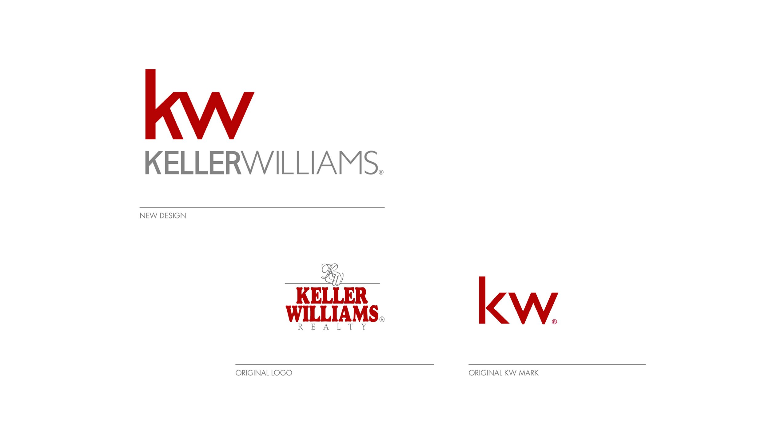
Throughout my tenure at Keller Williams, I played a pivotal role in crafting a cohesive identity system and brand for the Keller Williams family of brands. This encompassed not only the redesign of the parent brand, KW, where I collaborated with Ashley Rogers as the principal designer on the KW mark, but also extended to their coaching company, KW MAPS Coaching, and various ancillary businesses. The concept I created served as the foundation for the current brand system.
In designing the brand system, my focus was on ensuring that each component felt interconnected and worked harmoniously together. I prioritized flexibility, allowing the brand to expand seamlessly across different entities within the Keller Williams family while maintaining a unified and recognizable visual identity.
Brand Evolution

Evolution of KW Mark. Designer: Ashley Rogers. Market Center Logos. Designer: Caitlin McIntosh
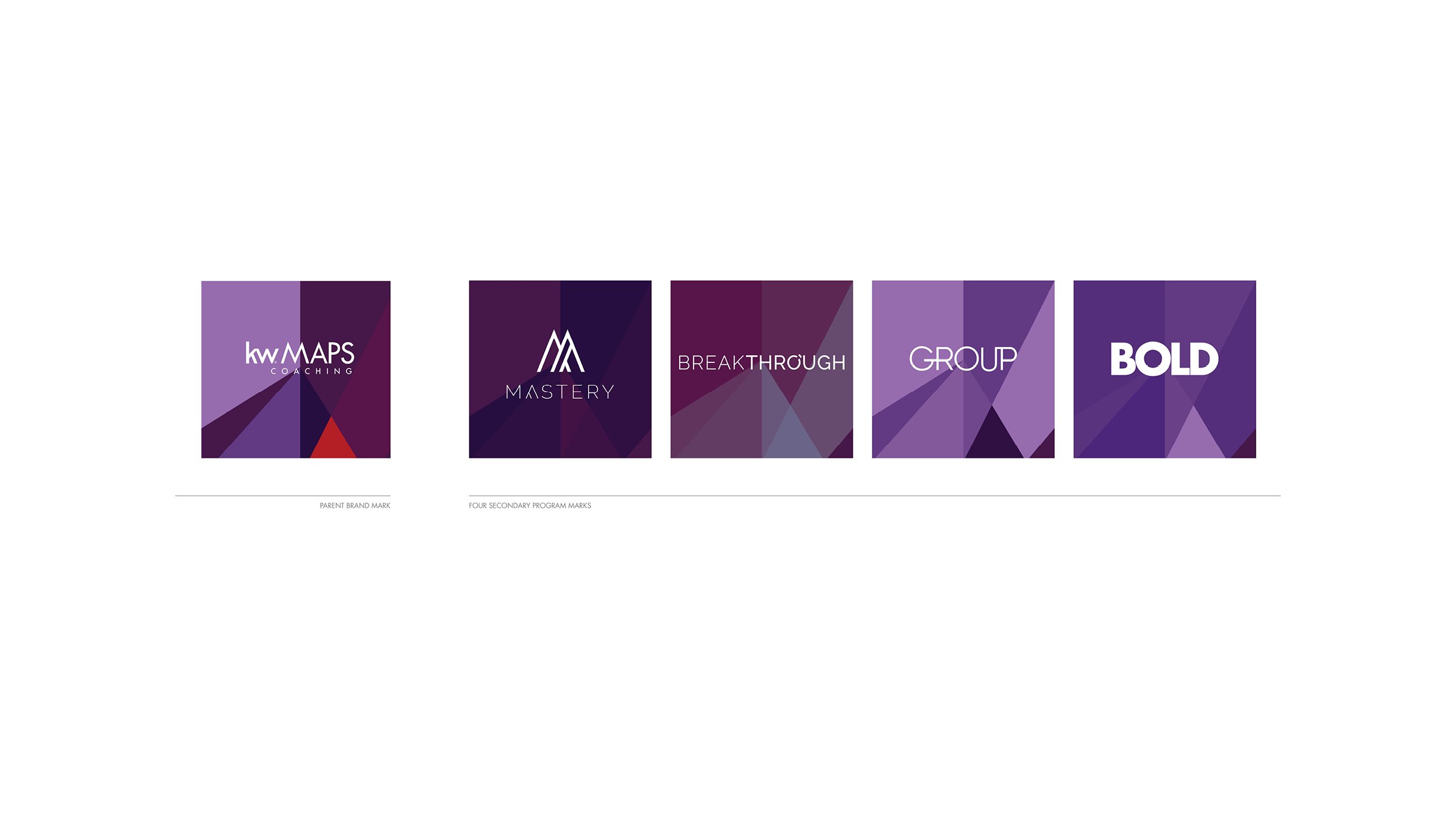
Brand Extension for Subsidiary Brands. Each brand was unique in colorway and pattern

A part of a team who developed an identity system and brand for Keller Williams' ancillary businesses. The challenge was to establish a connected and cohesive system that allowed for flexibility and expansion. Each individual business under the KW umbrella required a unique logo, icon, or identity mark, yet it was crucial that these elements worked harmoniously together to project a unified brand presence. This concept became the basis for the current brand system. Concept Designer: Caitlin McIntosh

Concept work: Application of brand work